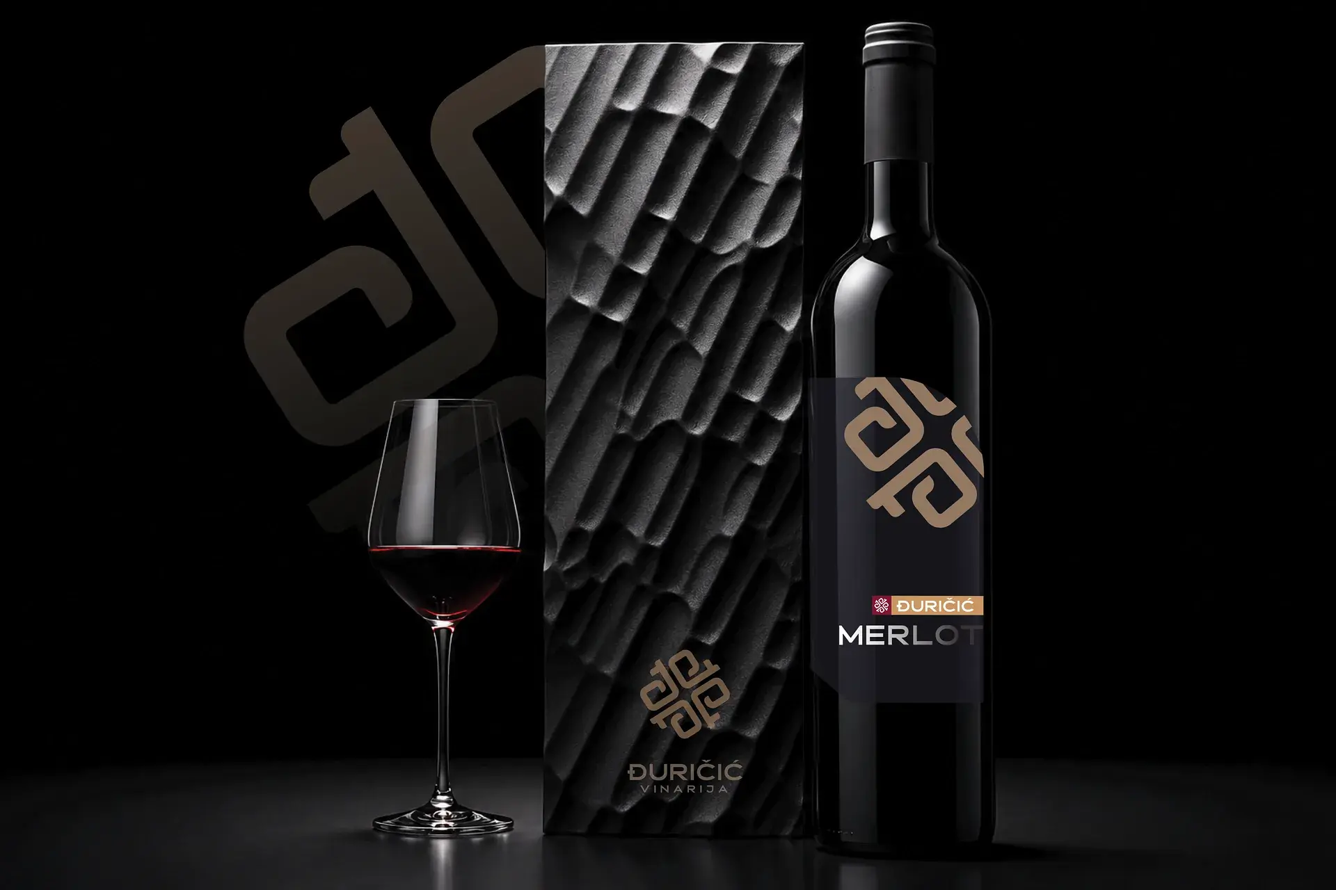
Vinarija Đuričić: visual identity, Draško Bošnjak
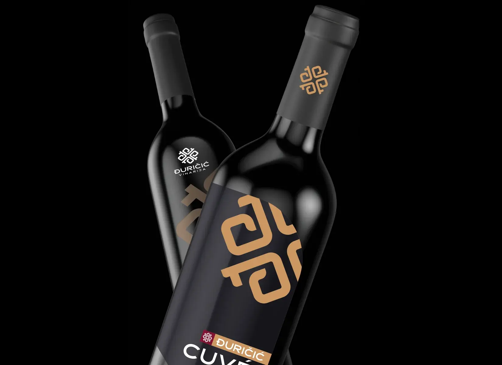
Visual identity for a family winery
A mark from the letter Đ and an old key
on labels, boxes, bags and a sign
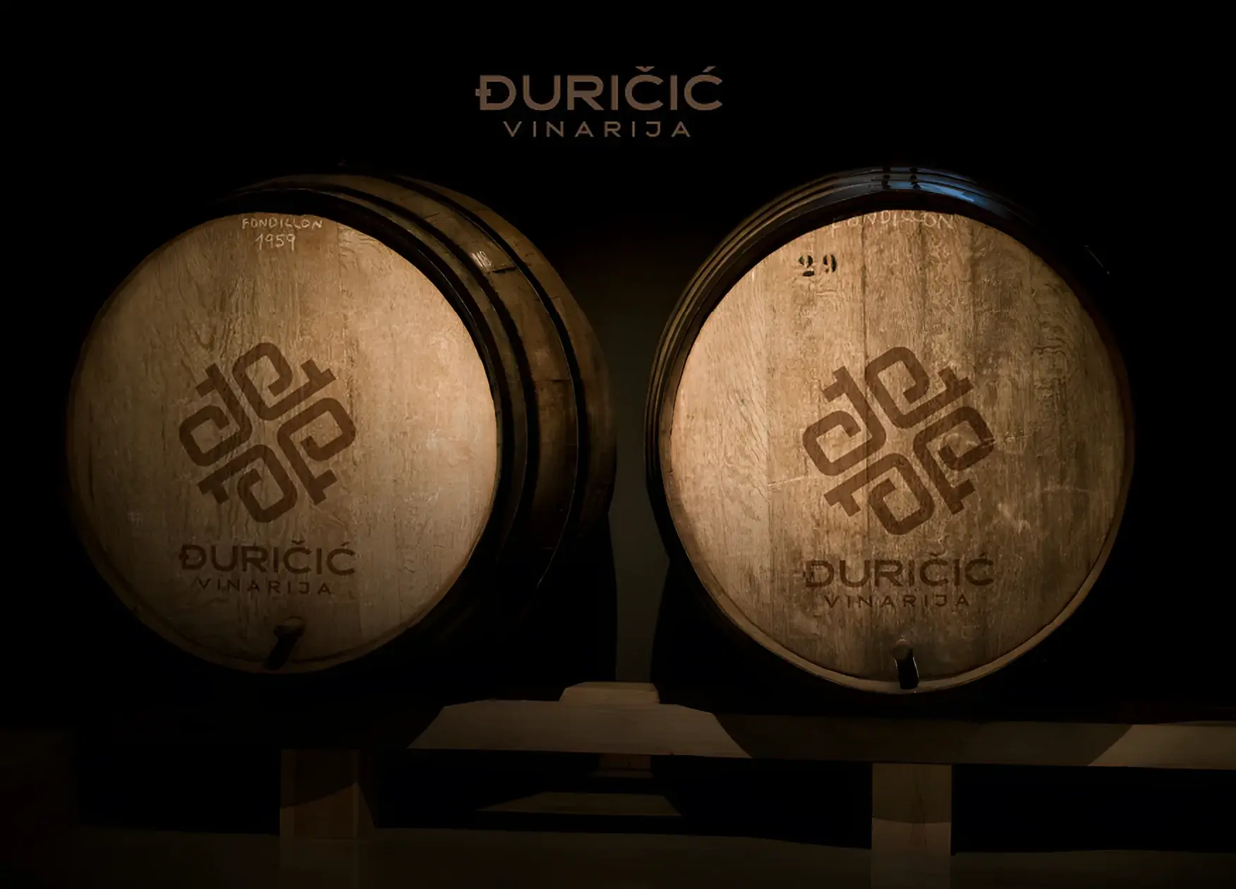
The letter đ and
an old key
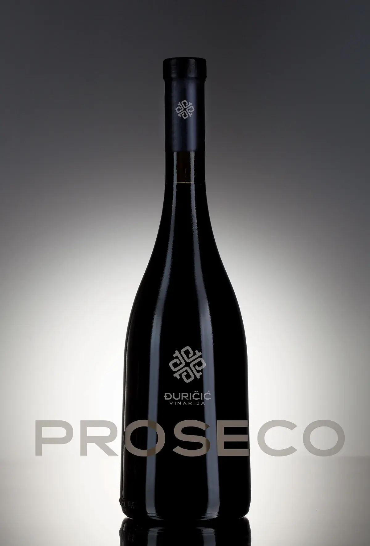
The mark joins the letter đ, the initial of the winery founder’s surname, with the form of an old cellar key, a symbol of tradition and of opening new possibilities. Four identical elements connect into a unified mark with strong symmetry, rhythm and visual stability.
Application
of the identity
The solution is minimalist but conceptually strong: a simple form grows into a more complex whole that is easy to remember, works at different sizes and suits long-term brand communication.
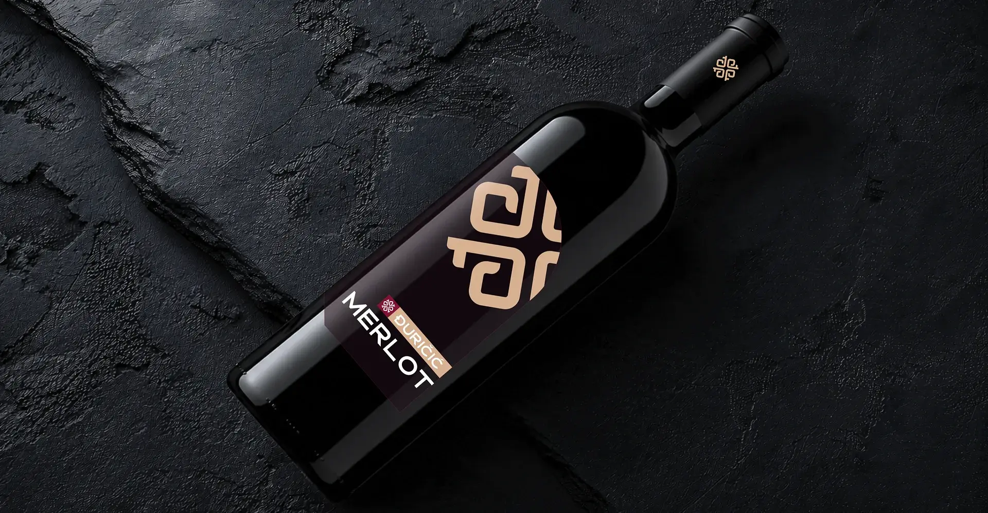
Merlot
Proseco
Gift box