My Home: visual identity for a tile company, Draško Bošnjak
Visual identity for the tile showroom
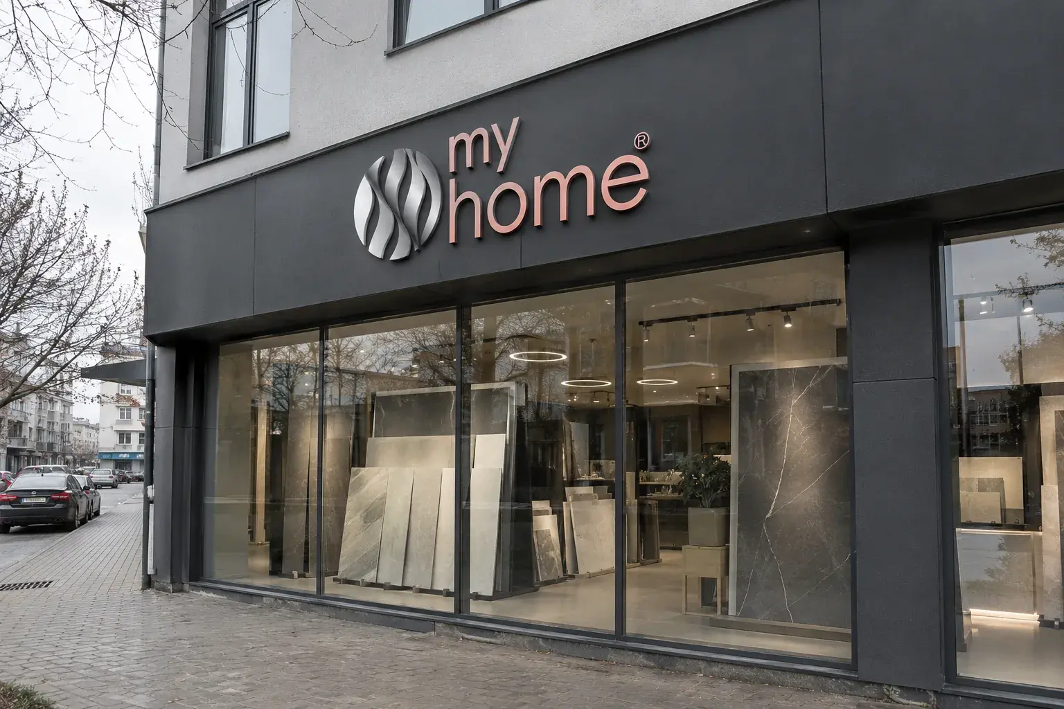
My Home, Banja Luka.
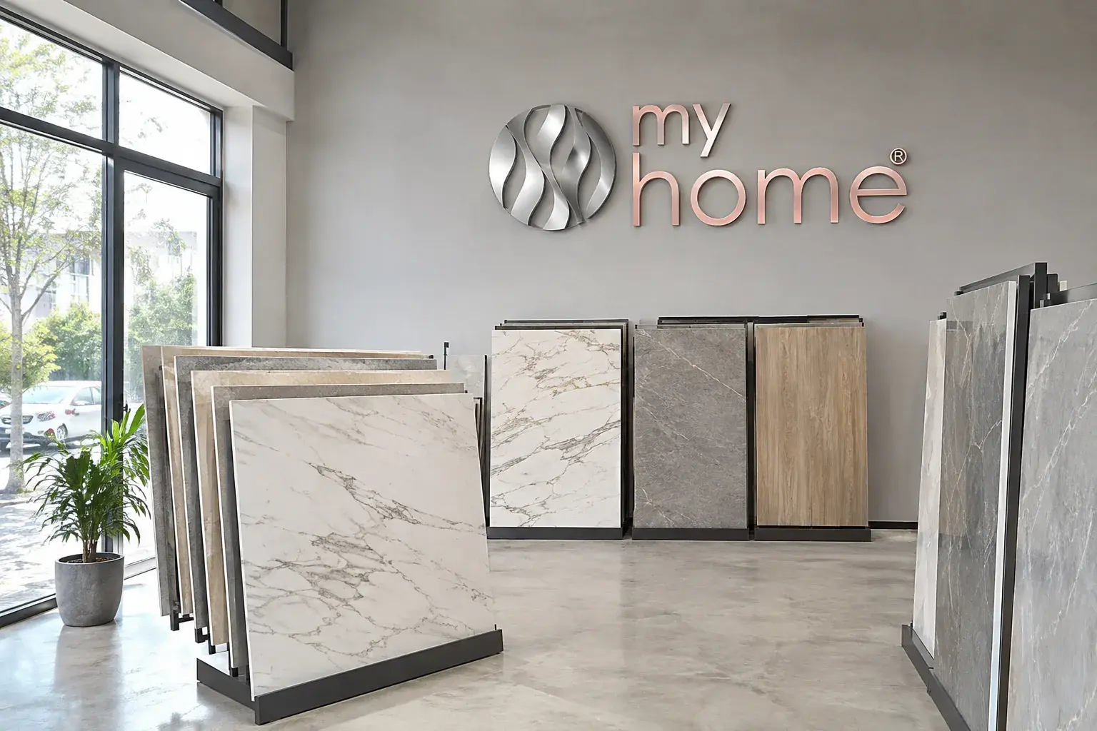
The same mark, from the illuminated logo in the showroom
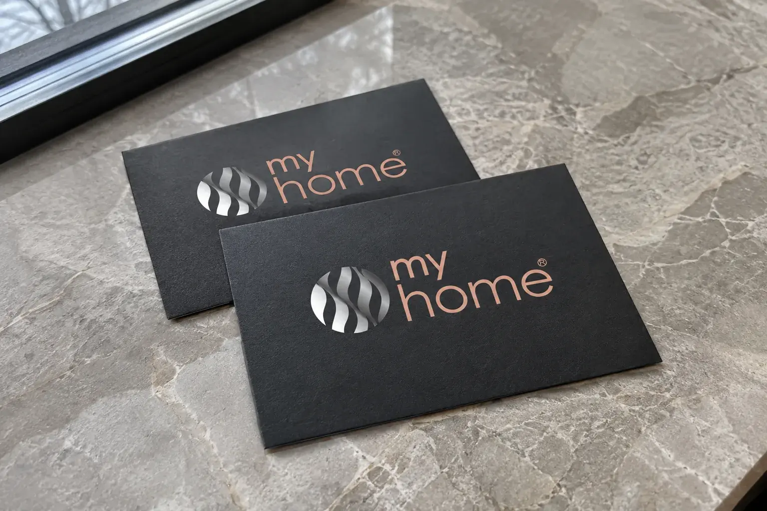
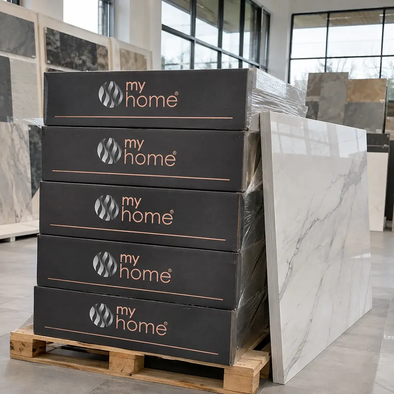
to the tile box and business card
Water
as a mark
The circle stands for wholeness, harmony and home, which ties into the name my home. Inside it, wavy bands build a three-dimensional, fluid form: water running gently and freely down the tiles, like a waterfall. The ceramics showroom gains purity, ease and a natural element, frequent motifs in interiors and bathrooms.
Colors and versions
Metallic tones give a sense of quality and luxury, gray and dark tones add balance, so the shiny mark stays in the foreground. The lowercase lettering is warm and approachable.
Rose gold#E2A993
lettering; quality and warmth
Chrome#8F9194
the mark, like polished metal
Graphite#414042
background, calm and balance
Primary
Large mark
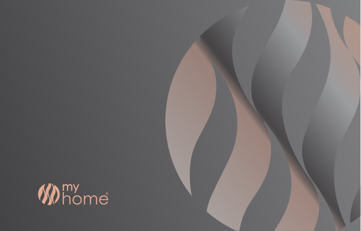
On gray
Application
of the identity
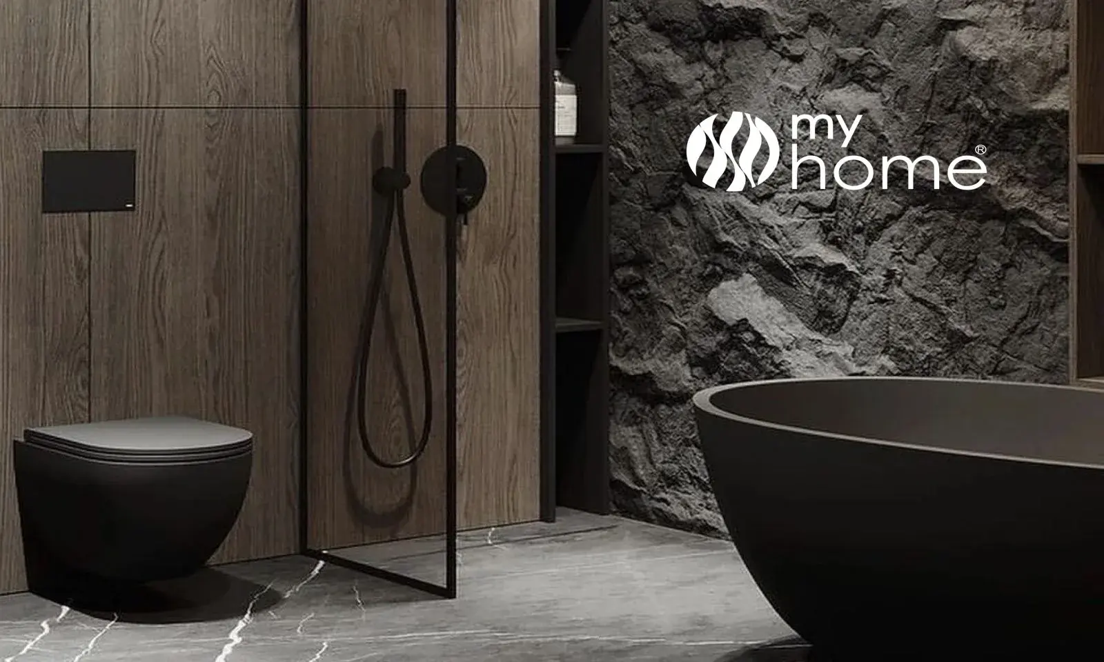
The logo lives in the space, alongside marble tiles, ambient light and running water. In a ceramics showroom the customer isn't only buying tiles, but atmosphere, harmony and a home.
Showroom
Storefront
Packaging
Business cards