Expera Pharmacy: visual identity for a pharmacy chain
Visual identity for the pharmacy chain
Expera Pharmacy
59
pharmacies
27
municipalities in Republika Srpska
8
pharmacies in Bijeljina, the chain's headquarters
20,000+
products
Source: experapharmacy.com, October 2026.
The letter X
in a circle
The line of the X connects green and blue, nature and science, and the circle around them speaks of wholeness. The serif EXPERA carries authority and tradition, the airy PHARMACY modernity.
Colors and versions
Green stands for nature and health, blue for science and trust. The logo works in color, inverted on dark and as an illuminated sign on the facade.
Green#009345
nature, health, growth
Blue#003D80
science, expertise, trust
In color
Inverted

Illuminated sign
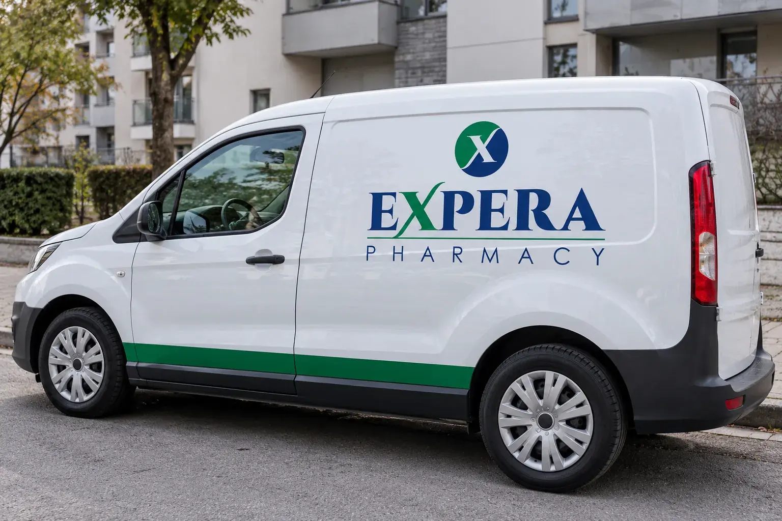
Application
of the identity
As a whole, the identity presents a pharmacy that unites the power of nature with the achievements of science and builds a recognizable brand founded on trust, expertise and a commitment to health.
Illuminated sign

Delivery van
Bag

Lab coat

Interior